5 Useful Diagrams for Product Managers
Why is diagramming useful?
The ability to draw and produce clear diagrams are powerful skills for product managers. Here’s a few reasons why:
- Articulate your point of view / ideas – with a pen and a whiteboard you can very clearly articulate an idea which is difficult to convey without a whiteboard. For example, you may be meeting with stakeholders to explain how a landing page may look or how a user journey may work. Trying to describe this without visual aids is often difficult.
- Problem definition and solving – excessive hand flapping in a meeting is a clear signal that a problem needs to be solved using drawings and diagrams. Knowing how to frame problems into the appropriate diagrams will help you to define and solve them.
- Earn respect from colleagues – being able to draw effectively on a whiteboard or summarise a concept in a diagram is somewhat of a superpower. Many people are terrified of drawing in particular; if someone in a meeting says ‘OK, would you mind quickly drawing your idea out please?’ you’re often greeted with shrieks of horror.
We covered how to draw on a whiteboard in a separate post so let’s now take a look at some useful diagrams instead.
1. Swimlanes
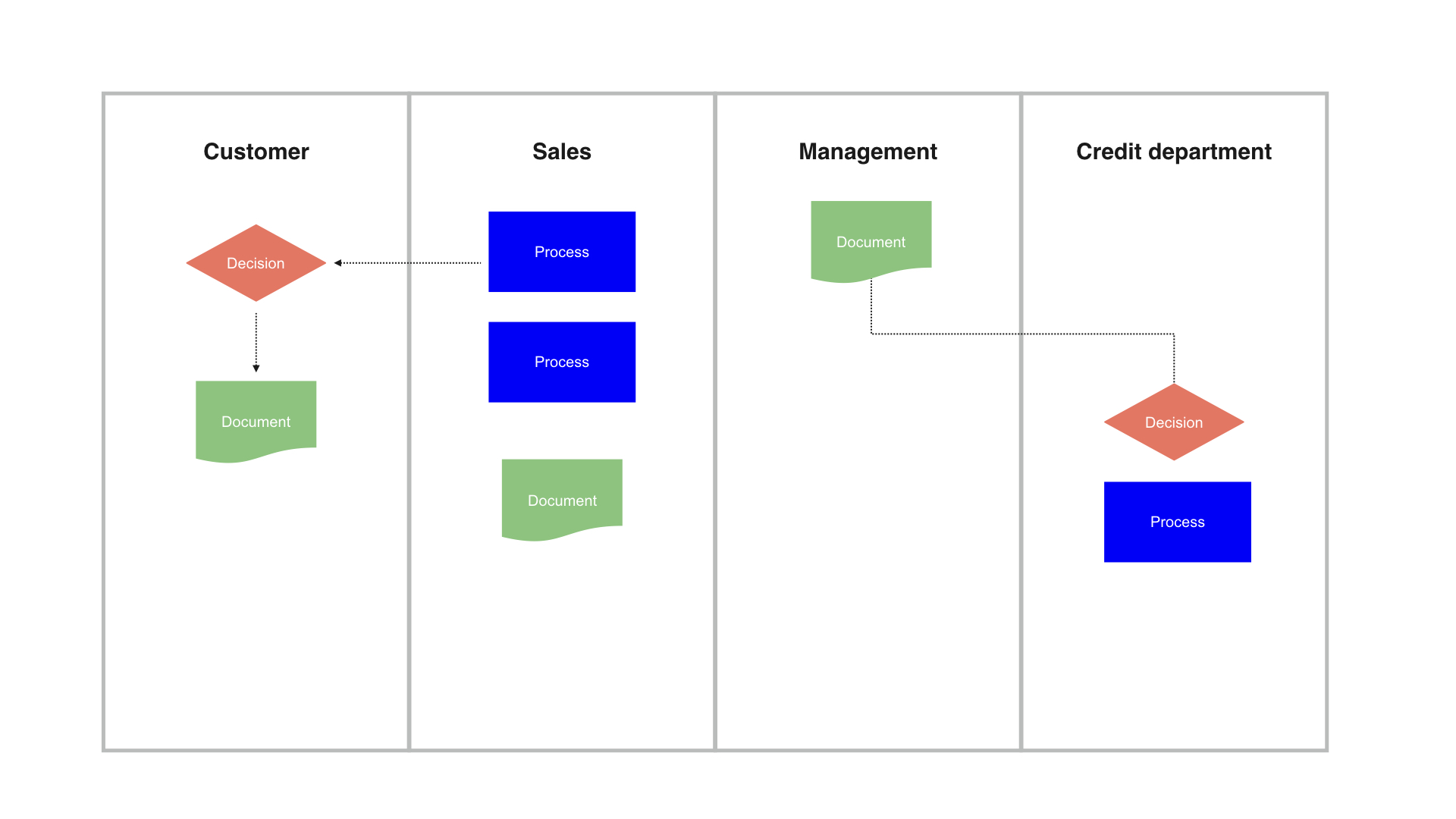
Swimlanes are a neat way of communicating complex processes. In product management, depending on your vertical, you may be building products which are designed to support the value chain of the business and as such, your products might involve multiple touch points across various parts of the business.
For example, you may be a PM working on customer service tools and as part of an upcoming release you’re developing an invoicing report. Yes, as product managers we like to believe we’re Steve Jobs but we’re often dealing with unsexy problems to be solved and features to support the business. In this example, it would probably be a good idea to flesh out the invoice generation process before building any solutions and a swimlane diagram might be the best way to do this.
Swimlane diagrams make use of standard icons which should be used to denote key processes and steps in the process. If you’ve ever been given a neat process diagram from your ops team using Omnigraffle and thought ‘what on earth does any of this mean?’ a good place to start is to understand the most common icons that are used in swimlane creation:
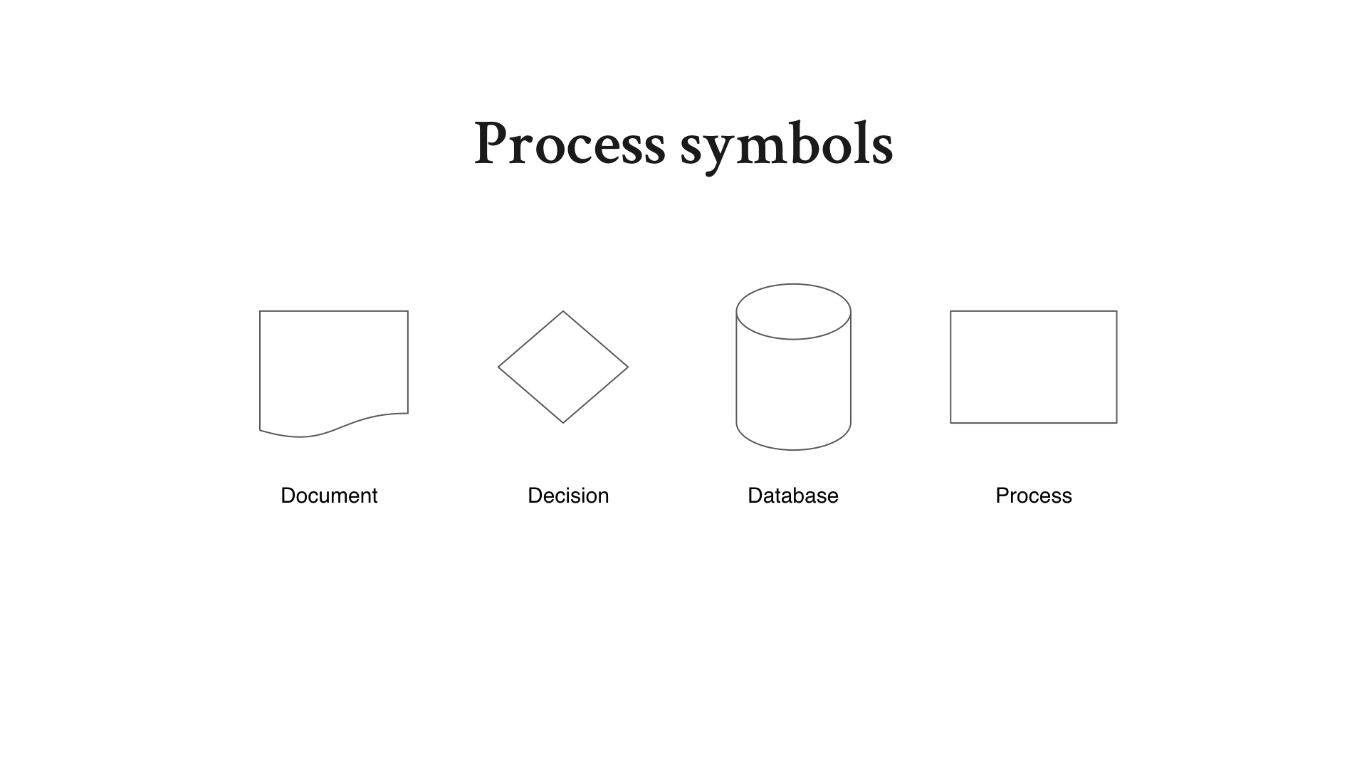
- Document – denotes a document that can be read by human beings e.g. a form to fill in
- Decision – this little diamond is used to denote a decision that needs to be made e.g. ‘has the user paid the last month’s invoice’
- Database – denotes the data storage part of the process.
- Process – denotes a key step in the process.
There are other symbols used in swimlanes diagrams but if you know these you should be covered for the vast majority of cases in product management.
When should I use a swimlane diagram?
Swimlanes are best used when trying to communicate processes that involve multiple stakeholders or parts of the business – or complex processes which touch upon different parts of your application.
If there is confusion about who does what at a particular stage in an overall process, a swimlane can clarify matters quickly and clearly. Invoicing, shipping and customer service processes are common uses for swimlanes in product management.
Swimlanes are useful to scope out processes before building solutions so that you can clearly understand the overall flow of a process. They are also particularly useful in highlighting blockers and dependencies to stakeholders and the rest of the business. If a particular department is giving you a hard time for delays, put together a clear swimlane and demonstrate exactly what’s causing the delay.
2. Annotated processes
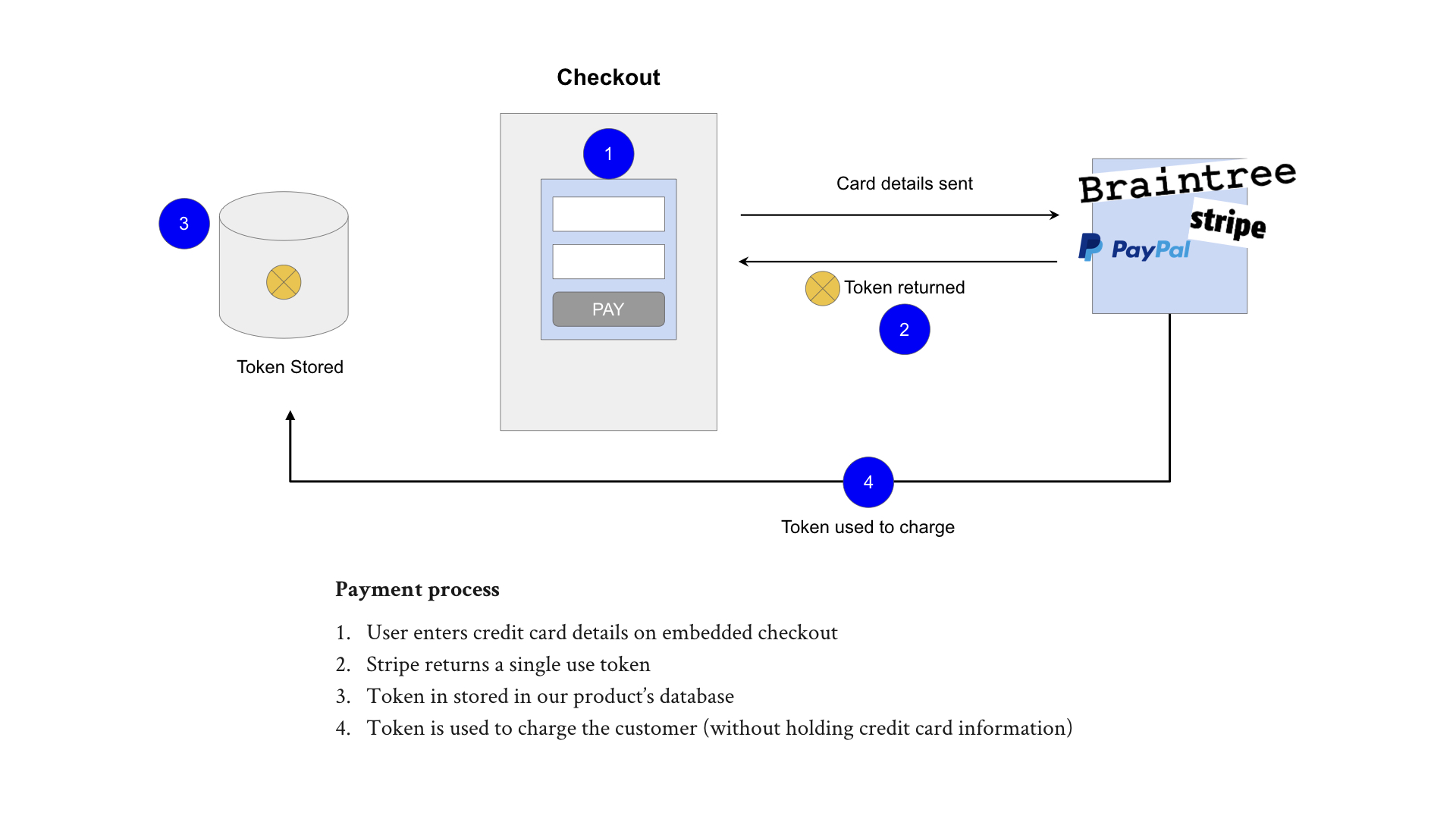
Annotated process diagrams comprise 2 key parts:
- The process itself visualised
- The annotations beneath, with numbers used as a reference
The first step is to diagram as best as possible (you don’t need to be Picasso), the key parts of the process you’re trying to communicate to the rest of the business or team members. This might be an API integration, a new payment provider or an email marketing sequence. Aim to keep the diagram as simple as possible and limit the number of components you diagram the minimum viable amount so as to not confuse your audience.
A common mistake people make is to try and include absolutely every aspect of a particular process but simplicity is better. Even if you know there are additional parts to a process, aim to only keep the bits that are essential to the audience you’re sharing the diagram with and the specific point(s) you’re trying to communicate.
With the process diagramed, identify the parts of the process you want to highlight to your audience and use a numbering sequence as a form of annotation. Once your annotated number sequence is added, include notes beneath the diagram so that your audience can clearly understand what happens at each stage.
When should I use an annotated process diagram?
Annotated process diagrams have plenty of uses but here’s a few scenarios in which you might find them most useful:
- When explaining to your engineering teams how a specific feature or story fits into the overall picture or process. You can reference the numbers in your user stories or specs.
- When stakeholders are uncertain about a specific part of a process.
- When putting together options for your stakeholders to decide. You can use the annotated numbers as a reference point to anchor your discussions.
3. User journeys
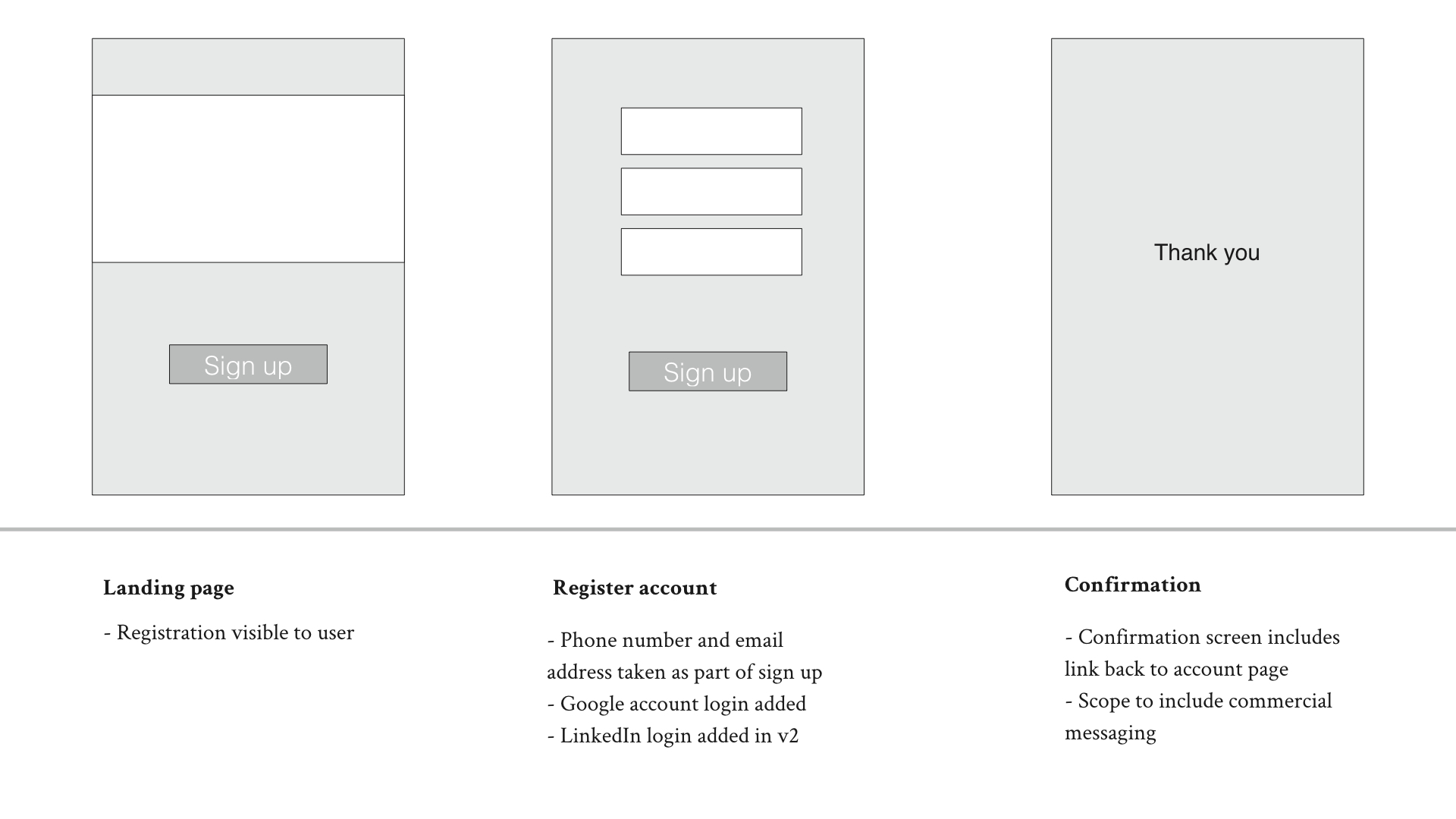
You’ll often be working with your UX teams to put together suggested new flows for new products or features and an effective way of communicating the proposed UX flows is to create user journey diagrams which can be shared digitally.
The goal of the user journey diagram is to summarise the key steps involved in a new user journey so that other folks can input into this process and give you some clarity and guidance on each step. Don’t bother with color or fluff; instead, stick to high level flows without too much details to ensure you focus on the overall flow / journey.
As is the case with the annotated process diagrams, the user journey diagrams are split into 2 sections: the top half for the process diagram itself and the bottom for annotations explaining further information about the specific step in the user journey.
When should I use a user journey diagram?
- New project kick off– user journey diagrams are often used when kicking off a new project or proposing a new feature. Starting at a high level you’ll use the user journey diagram to highlight the key steps in a given process and focus on reducing user friction. Having a bird’s eye view is essential to identifying potential points of friction and deciding what the overall user flow might look like.
- Making important changes – user journey diagrams are also useful when you’re looking to make changes to user journeys. Mapping out the entire journey up front helps you to make decisions about which parts of the process need to be modified and why.
4. Emotion mapping
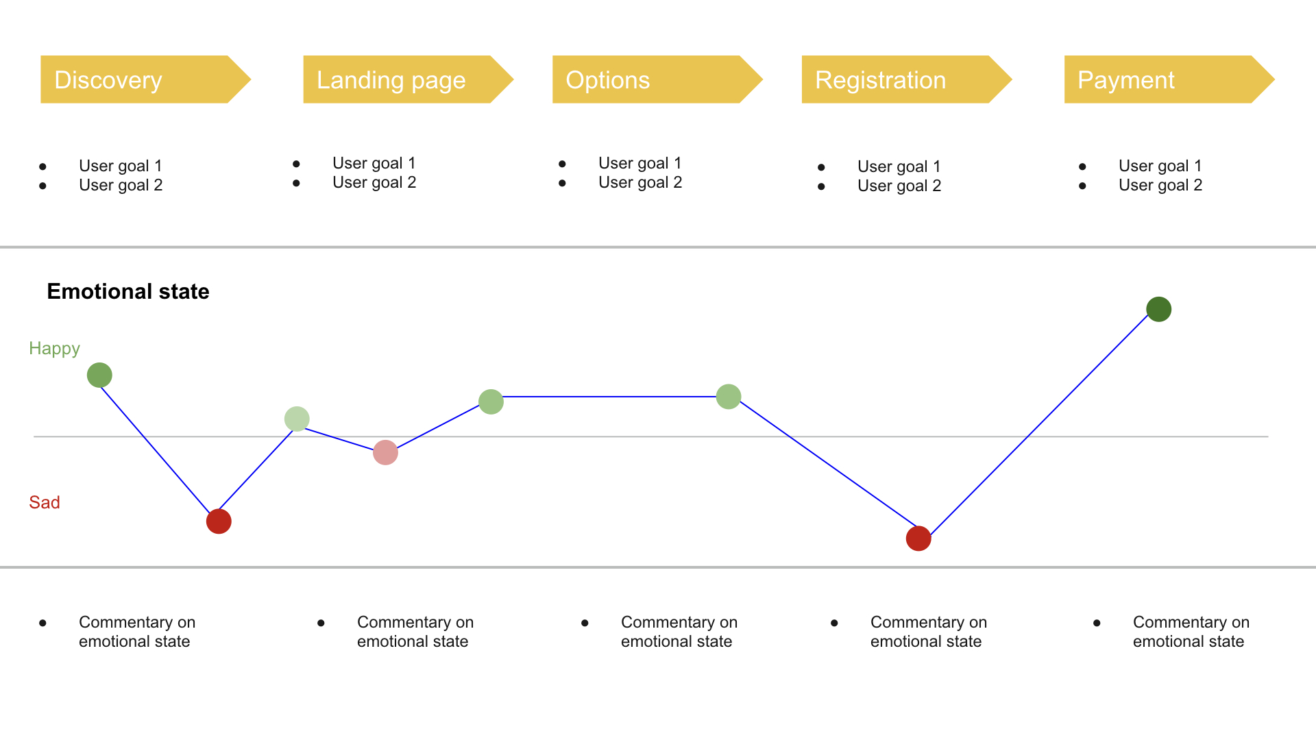
Emotion mapping takes user journeys a step further and layers on additional aspects of the journey so that you can clearly understand – and communicate – the needs and emotional state of the user at various points throughout the journey.
Break your user journey down into key steps at the top of your diagram, include user goals and plot the emotional state of a user at various points throughout the journey. The emotional state should be plotted using either positive or negative values on your graph. Increasing / decreasing the opacity of the red / green colors bring the emotions to life more vividly allowing you to express extreme happiness or blind rage.
When should I use an emotion mapping diagram?
- After usability testing – if you conduct regular usability testing (as we all know we should but sometimes we don’t!), you’ll often be left with a bunch of unstructured feedback. The emotion mapping diagram is an excellent way of collating your feedback and summarising your findings so that they can be shared with your team.
- Influencing opinions – if you’re in a debate with a colleague or a stakeholder over whether you should fix something you believe is broken, sharing the emotional state of users in the emotion mapping diagram is a powerful way to influence decision making. Everyone finds it difficult to propose something which is believed to be making people unhappy.
5. Decision trees
Not sure how to visualise or make a complex decision? Defining the behaviour of a specific aspect of your product isn’t always straightforward. Decision trees enable you to visualise the complexity of decisions so that they get out of your head and onto paper instead.
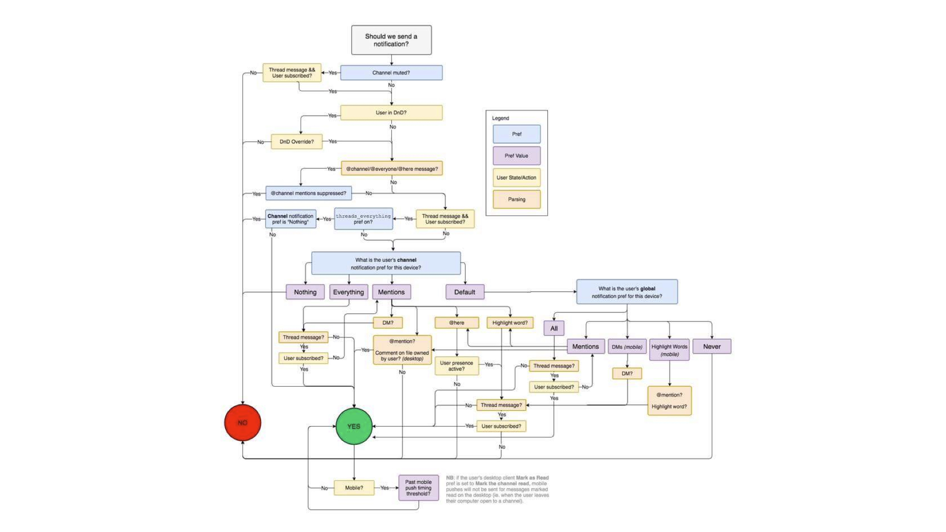
In this example, you can see how Slack decides whether or not to send a notification to a user, based upon the preferences set.
Decision trees typically start comprise of 3 core elements:
- The decision – the decision or question you are grappling with
- The steps – the series of steps and considerations that need to be made in order to decide upon 1 outcome or another
- The outcomes – the potential outcomes for your decision tree. Outcomes can be binary (yes / no) or a series of multiple outcomes, depending upon the process or feature
When should I use a decision tree?
Broadly, decision trees are useful whenever you need to articulate the conditions in which a different outcome is required vs. another. They are also useful for hypothetically choosing certain paths to see how they may pan out vs. other decisions before you make the final, real decision. Decision trees are also useful in the following scenarios:
- Engineering decisions – Decision trees are often used when working closely with engineers to decide on how a specific feature should behave in the wider context of your product
- Product priorities – you can also use decision trees to make product decisions. For example, if you’re trying to prioritise one specific feature or strategy over another, ask yourself a series of questions. Following the logical sequence of questions you’ll eventually reach an outcome or goal which will help you to make a final decision.
How to turn anything into a diagram
Whilst these are some of the most useful diagrams you might need to create as a product manager, there are plenty of other ways to visualise concepts to share with your team and stakeholders. There may be instances where you need to share an idea or concept but pre-existing frameworks don’t suit. In those cases it’s a good idea to learn how to create a bespoke diagram for that particular case.
In order to do that you’ll need to get used to the idea of turning anything into a diagram. Here’s a few steps on how to do just that:
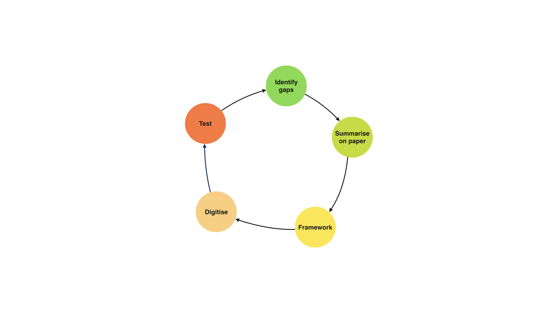
Step 1 – Identify gaps in your knowledge
The first step is to ensure you understand the concept or problem clearly before attempting to convert it into a diagram. Spending time with your team members to understand the process in more detail can help. Make a list of the gaps in your knowledge and seek out the people or sources that can fill in these gaps.
Step 2 – Paper notes
Once you’re confident you understand the concept clearly, summarise the steps of your process or concept on paper.
Use shapes and notes and be as creative as you like. Don’t be afraid to look like an idiot. Embrace the pen and draw shapes that make sense to you.
One trick which is particularly powerful is to imagine that you’re teaching the concept to a 7 year old. If you have children imagine how you might teach or explain the concept to them and draw shapes and symbols which help.
Step 3 – pick the appropriate framework
With your scribbles complete, take a look at your diagrams and decide whether they might suit a framework. Is it suitable as a swimlane? Would it look good as a annotated diagram? Think through existing frameworks and use them if they are appropriate. If not, no worries.
Step 4 – convert to digital
If you’ve finished your scribbles and picked a suitable framework, it’s time to digitise your diagram so it can be shared with the wider team. There are a whole bunch of tools you can use to do this (we’ve included a list at the end) but pick a tool you’re comfortable with and do your best to create a digital version of your diagram.
Step 5 – test before sharing
Before you share anything with your intended audience – and particularly if this diagram is going to be used as part of a presentation or an important upcoming meeting – it’s a good idea to quickly test the diagram with a teammate beforehand. Ask a colleague to take a quick glance at your diagram and tell you whether it makes sense. The best way to test this is to ask them to explain to you what the diagram is demonstrating. They may not know the background but if they can grasp the general concept this is a sign you’ve done a good job.
Useful tools
Interested in getting better at diagramming? Here’s a few of our favourite tools:
- Google draw, Google sheets – the free tool from Google. Does the job in 90% of cases.
- Omnigraffle – a little pricey but will give your diagrams an added feel of professionalism. Useful if presenting to 3rd party / external clients.
- Invision – typically used by UX / design teams but particularly useful for adding annotations which can be commented on / discussed
- Sketch – like Omnigraffle, a little pricey but great if you’re obsessed with making your doodles look pretty
- Paper by 53 – a beautiful little app for iPad / tablet users who like to draw
- Remarkable tablet – want to splash out on recreating the pen and paper experience digitally? Grab yourself a Remarkable tablet.
Product launches, news and analysis delivered to your inbox. Weekly.