Accessibility Checklist for Product Teams
Why accessibility can no longer be treated as an afterthought
Accessibility is the practice of improving the usability of your products for a broad audience. When product teams hear the word “accessibility” they may think first of people with physical conditions: low vision, color blindness, or difficulty operating keyboards. Accessible products also address the needs of people who read at different grade levels, process information differently, or speak a different language than our internal team usually uses.
Many product teams treat accessibility as an afterthought. But accessibility deserves to be treated as a primary concern for product teams – many countries make certain standards a legal requirement. It’s an ethical responsibility that we all share and accessible products make all of our lives easier. Think about it: if your design team makes text more readable, this is not only helpful for a customer who has difficulty reading small fonts. It also means that a customer who has perfect vision but happens to be reading on a screen that reflects sunlight can easily read that text as well.
With all of that in mind, here is a checklist that your team can use to ensure that what you are building is accessible.
1. Visual Design Guidelines
Typography
Any text that displays on your website or app should be both easy to read by default and adjustable for the user. Make sure that fonts are large enough and that text is easy to distinguish from the rest of the visual information on the screen.
As shown above, the browser display for Medium.com is highly legible and comfortable to read. Here are standards to keep in mind when displaying text:
- Use high contrast text. According to the international standards set by the Web Content Accessibility Guidelines, the ratio of contrast between the background and text should be high. All visual presentations of text and images should maintain a contrast ratio of at least 4:5:1.
- Select large fonts. The absolute minimum font size that text can be is 9 pts or 12 px. Larger text is better: the optimal size on desktop is 16px to 18px. For mobile devices, follow the recommendations set out by the device manufacturer. Apple’s Human Interface Guidelines suggest font sizes of at least 17 pt. Google’s Material Design standards recommends text be at least 16 sp.
- Select fonts that are clear and legible. There are no strict rules about the exact fonts that must be used on a usable product. It’s a common misconception that the only appropriate fonts for screens are sans-serif fonts. If you’re not familiar with the difference between sans-serif fonts and serif fonts, take a look at the example below:
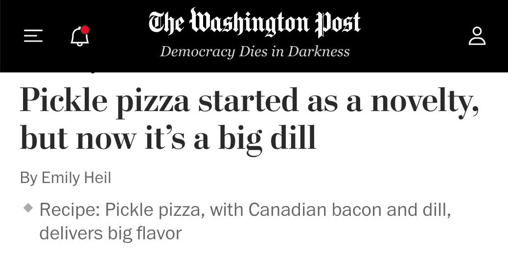
The headline is styled in a font that uses thin strokes at the end of a thicker stroke. This style is usually associated with print typography. The byline and blurb are styled in a sans-serif font. Both the serif and sans-serif text here is easy to read because the fonts are high-contrast, appropriately sized, and don’t feature unnecessary decoration. Compare that to the font used on the “The Washington Post” banner – that highly decorative font would be difficult to read if used for interface or article text.
Interface Design
Interfaces should prioritize ease of use over exciting visuals. Eye-catching graphics that delight designers may frustrate people who have low vision. When your product team builds apps or websites, it’s best to create interfaces that are uncomplicated and clear. Here are a few considerations to keep in mind to ensure that your team is designing accessible interfaces.
- Never use color as the only indication of important information. The most common type of color deficiency is red-green colorblindness, which impacts 8% of the global population. Many interface designers use green and red to indicate either task success or failure respectively. If color is the only indication, people with atypical color vision may miss critical information.
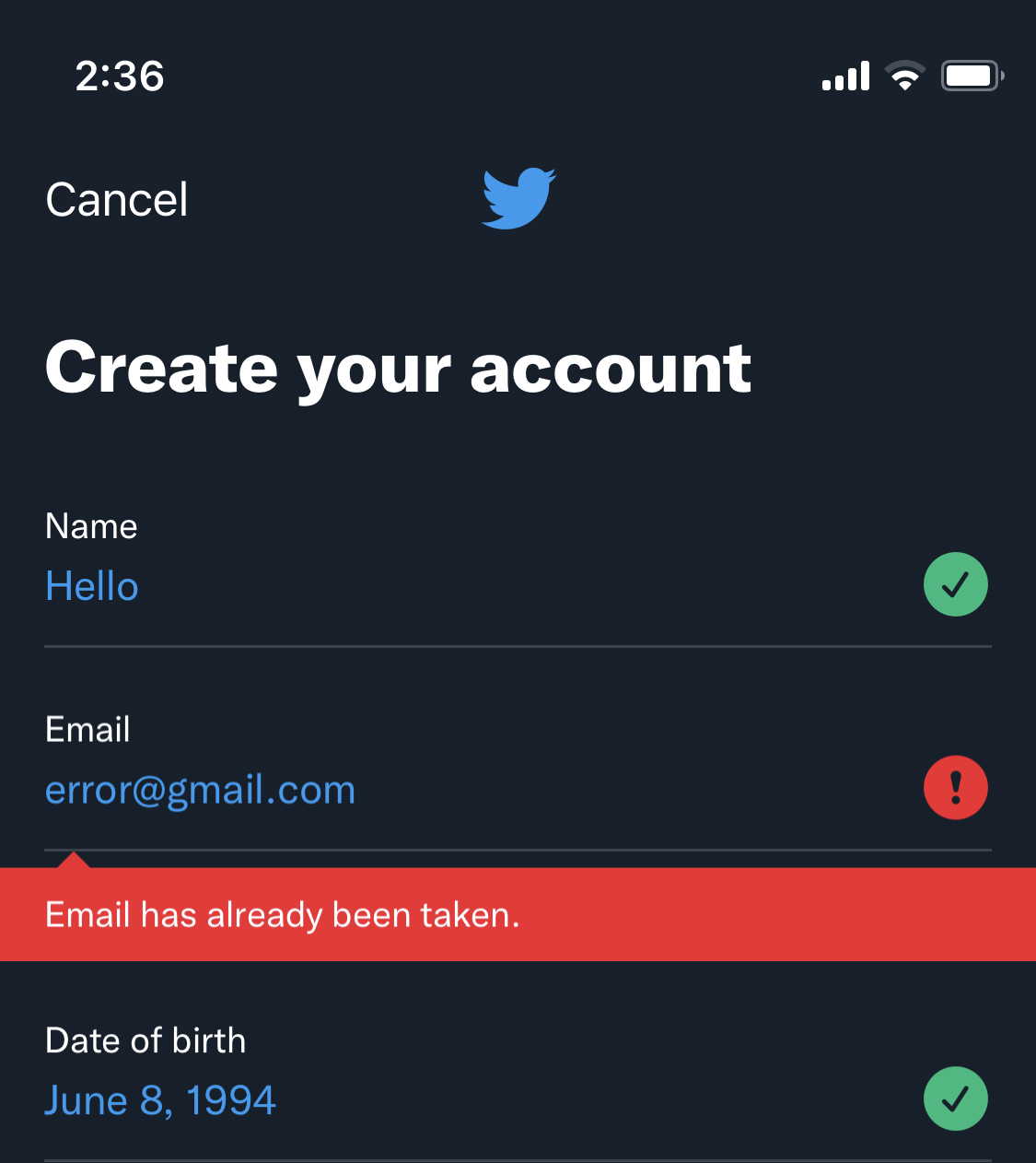
In the screenshot above, Twitter shows multiple indications that an error has occurred. Color is one indicator: the error message appears in red and a red icon also appears. However, there are other interface elements that help the user understand what’s going on: the error appears on a solid background, an icon with an exclamation point appears beside the field, and text describes the exact nature of the error.
- Never design interface elements with flashing or strobe effects. Excessive animation as a trend has, thankfully, largely fallen out of fashion in product design. However, some designers still embed video elements or elaborate parallax effects that may flicker or flash on the screen. This design choice may cause seizures for people who have epilepsy.
- Avoid using images as primary displays of information. When images are used, ensure that they are accompanied by descriptive alt-text. Do not present text as part of an image-only infographic. When images appear in the design of a website, use descriptive alt text captions to describe the content of the image.
- Don’t use tables as a design element. Some designers and front-end developers style websites using tables. Most screen reading applications explain how many rows and columns are present in a table aloud. This is helpful when the screen reader explains a data chart but can be very annoying when describing an ordinary page.
2. Interaction Design Guidelines
Plan for simplicity when designing interactive products. Remember that the average session time for most mobile applications is quite short. For websites, expectations are evolving and people expect better experiences. Simplicity is not only more accessible but more generally pleasing.
- Use large touch targets when designing apps for mobile devices. Large touch targets are easier for users with mobility impairments. Older users who may have less manual dexterity or arthritis will appreciate easily selectable targets.
- Avoid autoplaying videos. Videos should rarely if ever play automatically. Automatically playing videos is disruptive for users who use a screen reader. Some people are sensitive to sudden and unexpected noises. This is not only more accessible but just more polite overall. People who would not describe themselves as needing any accessibility accommodations describe this feature as annoying. In product management, teams are often challenged with achieving metric-oriented outcomes when chasing things like OKRs. An autoplay video might increase ‘engagement rate’ metrics but this misses the wider context – and has little regard for accessibility concerns.
- Use focus states. Focus states help people who navigate the web by keyboard understand which interactive element is selected. People who have repetitive stress injuries in their wrists often find navigation by keyboard more comfortable. Anyone using a screen reader also needs to know which element is in focus.
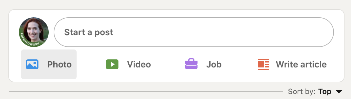
LinkedIn displays a clear focus state when hovering over an interactive element.
- Avoid using placeholder text as a replacement for labels on forms. Placeholder text is usually styled with less color contrast than the labels that appear above the form. People with low vision will not appreciate this stylistic choice.
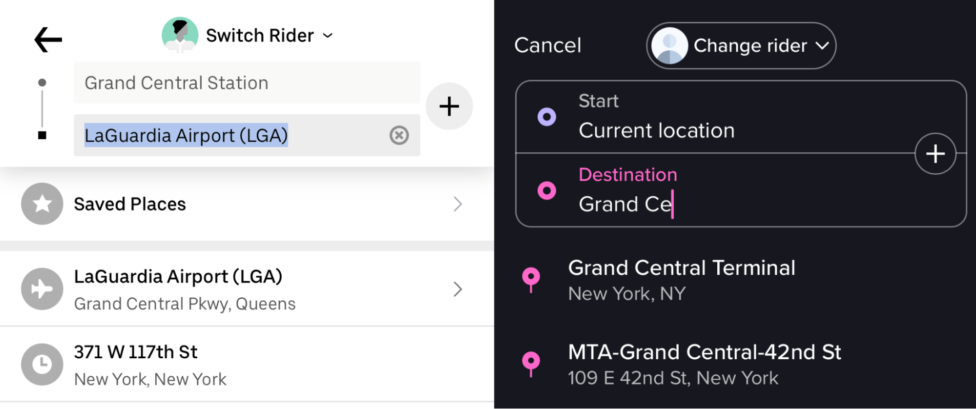
On the example above, Uber’s interface on the left uses no labels to distinguish the starting point and the destination. There is less contrast between the placeholder text (“Grand Central Station”) and the interface text used compared to other text on screen (“LaGuardia Airport”). It’s also less accessible for people who are unfamiliar with rideshare apps, people who have memory difficulties and people who are distracted while using the app. Lyft’s interface on the right displays labels above the interactive fields. Remember that most people using digital products are easily distracted and likely to be focusing on more than one task at any time. The average office worker reports being interrupted every 3 to 11 minutes. If placeholder text is the only label on a form field and the user is interrupted, he or she may not remember what was required.
3. Creating an Accessibility Audit Process
One of the guiding principles of most highly functional product teams is continuous improvement. How you structure that process of improvement depends on the size of your organization and the resources your team can expend.
Small companies and product teams can take advantage of free resources. The W3C Web Accessibility Initiative provides comprehensive guidelines on how to code accessible websites. There are many free online and browser-based tools that scan a website’s code to determine violations of various countries’ laws for access. Accessibilitychecker.org flags common accessibility problems and describes the issue in plain language.
If your product team has the financial resources to invest, consider hiring an accessibility consultant. These experts can identify issues that free tools can miss. Furthermore, they can help train your team so that your employees can develop expertise in building more inclusive digital products. Expand your hiring process to more actively recruit employees who have first-hand experience with the challenges inaccessible products pose. (One of the best visual designers I’ve ever worked with has red-green colorblindness.)
Mature product teams may consider hiring a full-time accessibility specialist. Accessibility specialists typically work cross-functionally, ensuring that digital products are usable for people with all types of physical and mental impairments. They report on current issues and recommend solutions. As accessibility becomes more standardized, product teams should invest in experts.
Conclusion
When I first began my career in design, accessibility was rarely discussed. Tech companies in the 2010s focused their attention on the young, the healthy, and the highly digitally literate. As the world of digital products expands, product professionals have a responsibility to think far beyond the experiences of whoever sits on our product team.
Remember that there is no “typical” user. People who speak 7,100 languages have access to the internet. People with different physical needs might want to buy the product you offer. We can barely imagine the scope of the world we are creating for, but accessibility helps us build responsibly.
Product launches, news and analysis delivered to your inbox. Weekly.